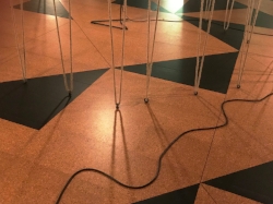
Beyond Time is a site-specific work installed in the Chapel at the Yorkshire Sculpture Park (YSP) by the Japanese born artist Chihura Shiota. Her large-scale works include The Key in the Hand, selected to represent Japan at the Venice Biennale in 2015.
It took 12 people 12 days to complete the installation at YSP. Shiota more usually works in black or red but in this instance the chapel demanded white, the colour of mourning in Japan, signifying also purity and the eternity that follows death. “I see [death] as a new beginning, not an end” (Shiota).

Beyond Time, 2018
Beyond Time references the history of the chapel and the people who celebrated life events in it. A steel sculpture echoing the outline of a piano represents the music and songs which no longer fill the space. Captured in the delicate web of threads are photocopied pages of programmes, sheet music and bell ringing schedules taken from the YSP archives. The overall effect of the work is ethereal and delicate though on closer scrutiny, the white string is coarse and the photocopies rough and ready.
Also on show on the walls upstairs are 4 drawings, oil pastels and threads in largely in muted tones of grey and enlivened with red. The figurative works suggest delicate bodies enveloped by a pulsing life force. Because much of her work takes the form of temporary installations, Shiota is currently exploring the lasting medium of bronze and is exhibiting Belonging, a sculpture of a woman’s and a man’s hand and forearm cradling a child’s. The work emphasises that more connects us than divides us.
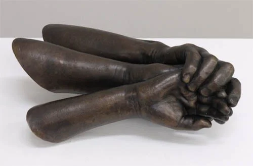
Belonging, 2017, bronze
The film Wall, shown in a small alcove on the ground floor is mesmerising and disturbing. Shiota is seen lying on the floor, entwined in tangled tubes reminiscent of intravenous drips. A red liquid pulses through the tubes to the hypnotising sound of a heartbeat. This moving piece is a reminder that Marina Abramović and Ana Mendieta were both teachers and inspirations at the start of Shiota’s career as a performance artist.

Wall, 2010 video still